Saturday, January 30, 2016

Stone - Spatter through Medallion

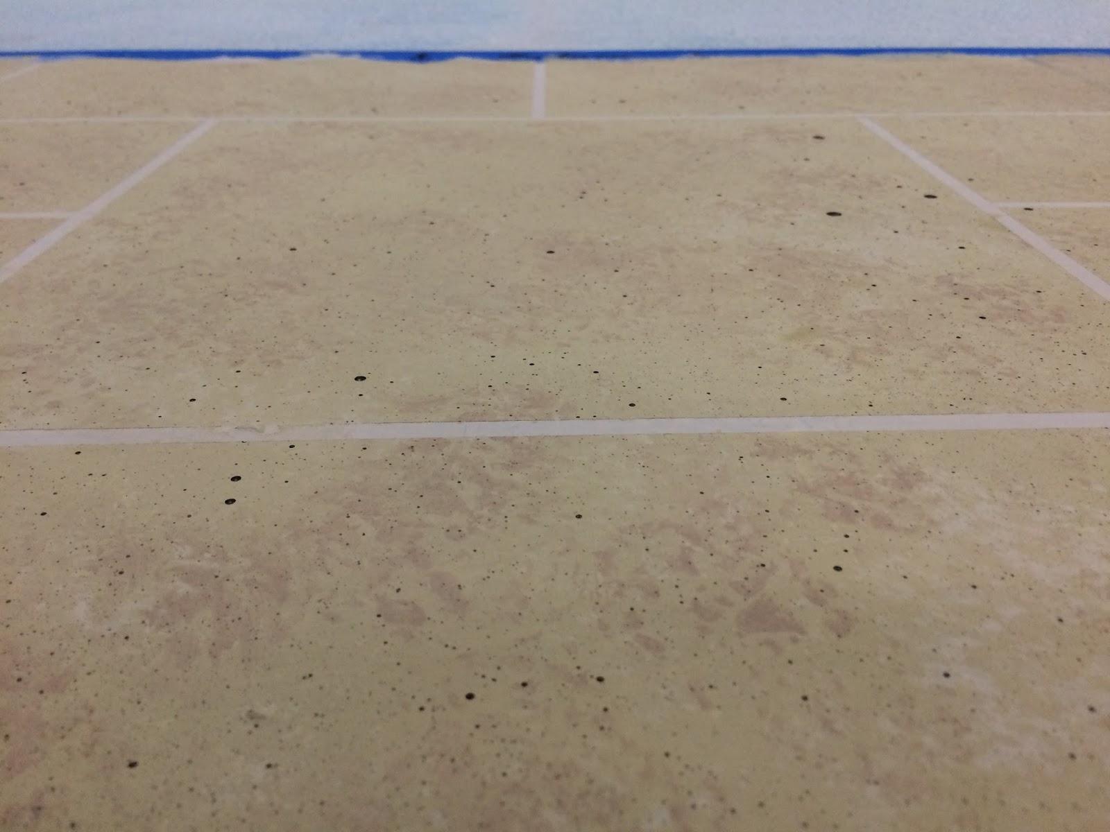
With our stone texture dry and the pattern punched, we can now move on to finishing the stonework with spattering. But wait! I forgot to mention the second stone texture. You can see it in the picture below where we used a reddish color to sponge on in a few places for added depth. This step was done before removing the painter's tape. The photograph was taken after the tape was removed to give you a better idea what the finished product will look like. The spattering was done by taking a chip brush and stir stick, then after charging the brush, running it over the edge of the stick to fling paint on the board. Careful not to get too much paint though or you'll get globs all over the place!

Finished Stone Texturing Waiting for Pounce

After letting the spatter dry, we could return to our paper with the medallion and pounce it onto our board. To begin, we taped two corners onto the board, which allowed us to peel the design back during pouncing to make sure the charcoal was coming through. Once the design was transferred, we removed the paper and drew in the lines very lightly, using a compass to maintain the original true circles. The graphite was then blotted away with a damp sponge, leaving the pencil marks behind. It was kind of a bear to get the charcoal up (I was a little heavy handed with it), and had some trouble with it smudging over onto my grout.

Pounced and Sketched Medallion

Shadow Lines Only
Now comes the tricky part. In order to give the impression of an actual shadow, we took a minuscule amount of premixed shadow color and added it to some water on the pallet. The way the shadowing technique works is that the paint is applied so conservatively and thinly that you can still see the color and texture underneath. Getting the shadow to the proper thickness took some experimenting, but once I got the hang of it, the most difficult part was avoiding hard edges.

Naturally, shadows have a tendency to kind of fade out in a very soft edge, and working the paint out until it faded on its own was the best way to get close to the natural appearance. Once the thin base was laid down, we could come back with more shadow and crisp up the deeper shadows under edges before laying in the highlights. Our highlight color was also premixed, and the instructor made the observation that the reason the 3D effect works is because each highlight is countered by a shadow, and vice versa. The highlight demanded crisper lines and a "bleaching" of the texture underneath with a heavier hand at its brightest.


Comparison of original image (left) with finished product (right).


Monday, January 18, 2016

Finishing Wood Grain

After completing the wood grain patterns, the next step was to cover the grain with a glaze that would give it the appearance of stain. Hopefully, the glaze is thin enough for the graining to shine through and will interact favorably with the base coat's color. The "stain" was made by mixing the color we wanted, then adding a clear gloss glaze that will make the finished product appear to not only be stained, but finished with a coat of gloss as well.

When the finish is applied, it's always preferable to run your brush strokes in the same direction as your grain to keep the pattern consistent. It's also a little tricky to get all your glaze on before it starts to dry without using so much that you wash out your original pattern. The best way is to get the thin coat you want on, then run your brush in long "finish strokes" from edge to edge, or else you'll wind up with ugly marks where you picked up/placed your brush. And once you start, don't stop. When the glaze dries you won't be able to blend another coat into the original and you'll wind up with hard lines on the places you missed! All in all, this was a fairly simple technique that just takes some practice to get the hang of. The finished product is great though!


Sunday, January 10, 2016

Day 3, Day 4: Wood Grain


For the wood grain training, we were given an image with several grains to reference and were tasked with matching the base color, grain color, and finish color. After mixing our grain color, we added a measure of gloss to make the paint more workable. When painting the base coat for wood grain, the brush strokes should run the same direction as the finished product to stay consistent. You can see how even though I only used the base color, there's still streaks that emulate basic grain.


The grain technique is accomplished by painting on the grain pattern, then lightly brushing over the paint with a single stroke. To avoid stray marks, the brush should be "cleaned" after each stroke. You can see where I've cleaned off excess paint by wiping my brush down on the table cover. I found the best way for me to achieve the desired effect was to paint on the grain lines heavily, then stroke over them before repeating the process. I did this to avoid shadow marks where the dry brush picked up too much of the paint. This is one of the textures I've really enjoyed doing, but I've been switching off between techniques pretty regularly to keep fresh eyes on my projects, so we'll come back to this one.


Transfer Project: Grid & Sketching


On day 3, in addition to brickwork and stoning, we started on our final project, which will be a transfer of a Disney concept image onto a 4’x6’ drop (landscape). We'll be using your standard muslin stretched over a wooden frame and starched for tightness. We lay our muslin out on the floor, then placed the frame on top of it, centering it so that there was a few inches of muslin wrapping around the edges. Working in teams of two, we started in the middle of the long edge and stapled in either direction, pulling lightly against each other to tighten it up some (not too tight though, otherwise it would rip during starching). Then we repeated the process on the short ends and tucked the corners.

Chalk Grid on Canvas for Ease of Transfer. Scale: 1 1/2" = 1'-0"

Once the canvas was mounted, the starch was mixed into a large container, then poured into a garden sprayer and sprayed in a couple passes onto the canvas. To mix the starch into the fabric, we cross hatched over the freshly sprayed starch with a clean brush. When it dried, a chalk line was used to mark 1'-0" squares that correspond with a grid on the original painting. I was assigned a Gustaf Tenggren concept image for Pinocchio:

Pinocchio Shipwreck ~Gustaf Tenggren
The most challenging part of this process so far has been mixing the colors to keep the wood on the shipwreck from winding up looking like a big splotch of dark - but we'll get into that down the line. The printed image is also a little washed out so my colors will deviate just a little bit more. For now, it was just a challenge to get the image transferred.

Completed (but not full) Sketch of Original Image - Charcoal on Muslin
 Sketching the outline of the ship proved to be more difficult than I had imagined. Because of all the lines in the planks themselves, getting the depth and detail in without losing track of the pieces meant leaving pieces blank for later. You can see where I left it open to the left of the rudder and in some places on the back of the ship. The sketch was done in charcoal because it's easy to dust off and paint over, but it's still best not to get too heavy handed or it will be harder to paint over.

Beginning Paint
Now that the outline was complete, I began (trying) to mix the colors for the lighter areas in the ship's interior. These will be painted first, then the planks and holes in the hull will be painted in after. I'm not super acquainted with color mixing, but with some practice and a lot of guidance, I was finally able to settle on two colors that will read well when used together. Some places, like the fallen door on the right have some dimension that gives us some good opportunities for highlight on the underside of the boards.
 

Saturday, January 9, 2016

Day 3: Bricks and Stones - Bricks

Much to my surprise, the bricking process was more 3D than I had expected. Instead of simply painting on a base coat over our grout color and using a tool for texturing, the brick material was actually a compound composed of white craft glue, joint compound, and paint for coloration. The cool thing about mixing it this way is you can make your bricks whatever color you want and don't have to rely on a company's inventory to make decisions for you.

Taped and Ready for Compound
We began by painting on a base coat of grout grey on a 1'x4'and taping out our grout lines. Our instructor mentioned that most bricks measure about 3"x8", and if we were actually constructing a set we would try and line up the bricks uniformly as if they were laid into a wall. For our purposes though, it was recommended we stagger the vertical lines so it doesn't wind up looking like there's a straight line scoring down the center of the piece.

This technique should be used on a horizontal surface. If you try to do this with your wall standing up, the mixture will run and you'll wind up with melty bricks. A note on drying: Do NOT use a fan to dry this medium. If it dries too rapidly, the mixture will crack and can pull away from the board you're using. It's also a good idea to use a textured surface for your materials that will give the mixture a good tooth. Final tip - make sure the tape lines that don't reach the edge of the board are over the ones that do. That way when you pull up your tape you don't have to worry about digging to find your other lines.


Brick Mixture Smoothed with Spreader. Mixture is roughly 1/16" thick.

There's not much of a difference between these two photographs, but if you look closely you'll see that they have different textures. We applied the compound to the board in scoops then smoothed it over with an adhesive spreader to get an even coat (above) before texturing with a cement trowel (below). With a light touch, the smooth side of the trowel was dragged across the compound, which has the consistency of thick "goop", allowing it to keep its shape while creating flat peaks and wide, shallow valleys. We then left it to dry for about the time it took to clean our tools, then came back and peeled up our tape. The idea is to let it dry long enough that it holds its shape and doesn't fall when you pull the tape, but not so long that it cracks or refuses to pull.

Brick Mixture Textured with Trowel


With these steps complete, we put the project on standby while we started work on our final project - stretching the canvas and transferring our images.


Brick Mixture as it Dries

Wednesday, January 6, 2016

Day 3: Bricks and Stones - Stone

So I'm starting this blog on Day 3 of the scenic painting class due to the fact that for the first few days we were focusing on our basics and learning about the nature of the paints themselves. After finishing our crash course in the basics (sponge on/off, wet blend, priming, wood blocking, ombre), we're ready to tackle some more advanced techniques. For this stage of the process we started with a 4'x8' sheet of masonite taped in half and lay down a coat of primer, followed by a coat of grout grey.

As the grout color was drying, we took a medallion example and drew it out onto a piece of brown paper. The drawing was then punctured by a pounce wheel for us to use a charcoal pounce for a direct transfer onto a dedicated 1'x1' square in the center of our stone wall. The circles were accomplished with a pair of compasses, then the floral patterns were sketched in by hand. If you look closely, you can see where I treated the drawing like cartography, drawing several lines to map out each quadrant of the pattern before inking the hard-to-read pieces with sharpie. You can see how the medallion will fit into the stone in the photos below.

Once the "grout" was dry we took lengths of 1/2" painter's tape to mask the outline of our stone pattern, leaving a square in the middle. The medallion will eventually be pounced onto the square, but not until we've completed the rest of our base stone textures and are ready to put on the last touches. Below you can see how the pattern will turn out and get a rough idea of what the finished layout will look like. The third and fourth photographs below are examples of the next step. The base stone color was painted on over all the tape then sponged off for a weathered texture. At this point it was time to lay the piece out in front of the fans and focus on learning how to make the brick texture.


Tuesday, January 5, 2016

Before Photos!

This post is just for you to see what we started working with and as a reference for later on! It's not much at all, just our starting point.